Sproutastic!
VeraWall, a green company that sprouts living walls and rooftop gardens, tapped Giant Punch to create a logo that’s as unique as its mission.
Growth
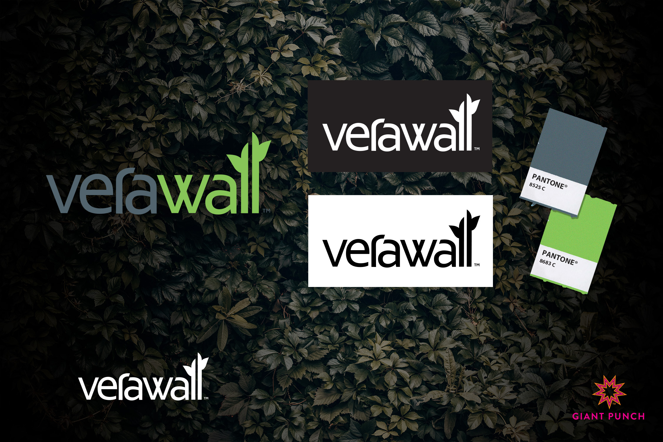
Giant Punch started with a clean font but couldn’t resist adding some elongated “l’s” with lovely leaflet sprouts to tell an instant story about VeraWall’s lush commitment to bringing nature to urban spaces.
Colour
Dive into the vibrant world of VeraWall, where the lively lime green harmonizes with contrasting grey tones, setting the perfect stage for a brand that seamlessly blends modernity with eco-friendliness.
This captivating color palette doesn’t just stop at being fun; it adds a touch of sophistication, invoking the ambiance of an enchanting English garden.
Imagine yourself surrounded by lush walls adorned with plants and vines, creating a timeless and refreshing atmosphere. Welcome to the visual allure of VeraWall’s brand identity!
Custom
Our passion involves infusing fonts with a touch of whimsy, adding that extra dash of interest and fun. In a playful twist, we extended the “r,” and then transformed the “v” in VeraWall into a distinctive “W.”
With some custom angles thrown into the mix, this logo evolved into a truly one-of-a-kind masterpiece. Because for us, every detail matters, and that’s what makes Verawall’s logo uniquely captivating.
If you are looking for a sproutastic logo shoot us a message! Contact Giant Punch today!
