Another Logo Knocked-Out!
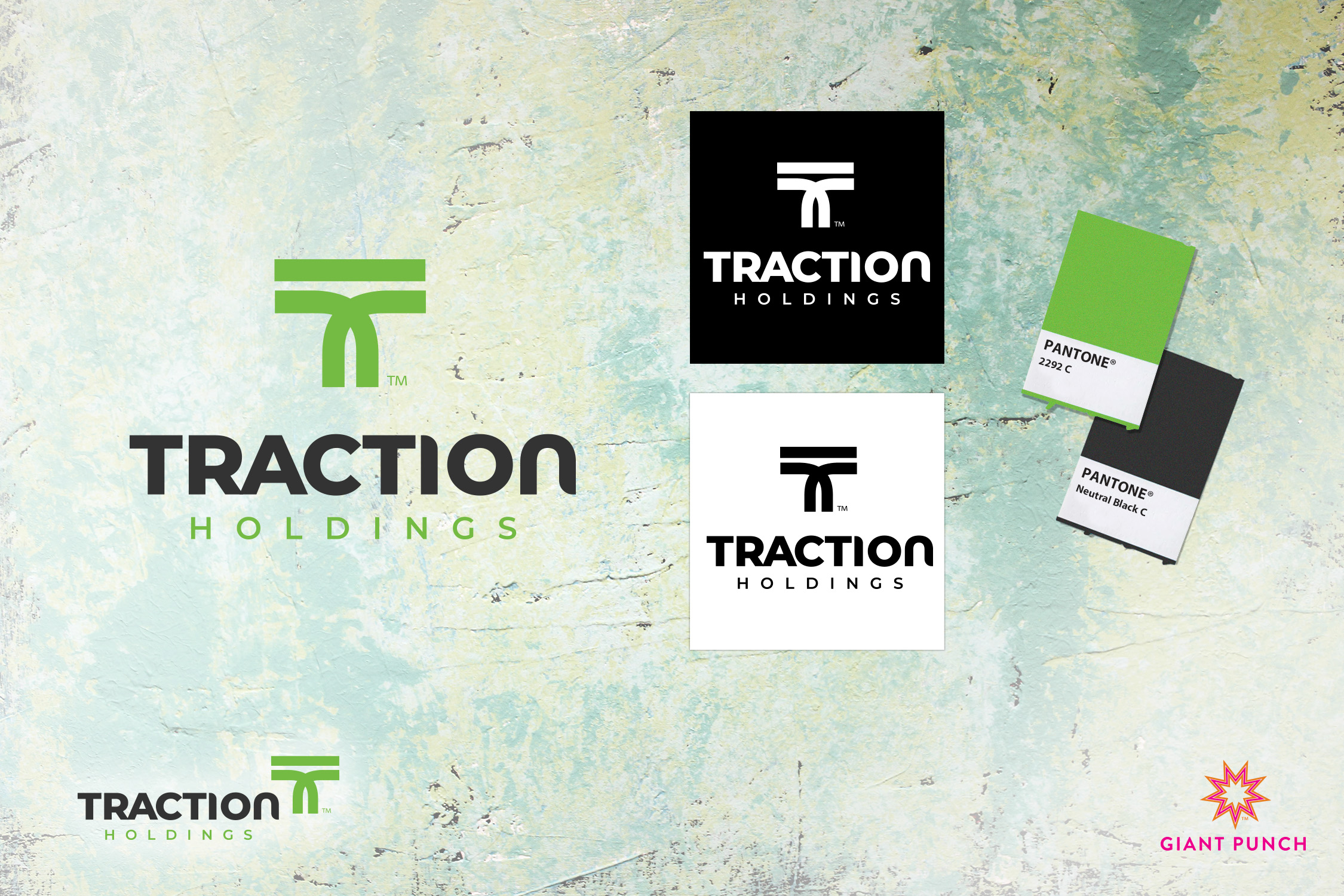
Giant Punch, your go-to branding and design experts, is excited to unveil this sleek and contemporary logo we crafted for Traction Holdings, an innovative marketing accelerator for brands and their in-house teams.
The “T” in Traction Holdings forms a tire tread, a clear symbol of the company’s dedication to propelling its franchise partners forward toward their objectives. This design’s interconnected lines express the crucial spirit of “togetherness” that’s integral to the company’s culture.
The logo’s timelessness shines in classic black and white, and it truly comes alive with a splash of color. It exudes a sense of power and resilience, qualities that perfectly align with Traction Holdings’ mission. Designed with versatility and scalability in mind, it seamlessly adapts from modest business cards to expansive billboards.
Giant Punch is delighted to have collaborated with Traction Holdings on this project. This fresh logo beautifully encapsulates the company’s brand, and we’re confident that it will serve as a dynamic force propelling Traction Holdings towards future success.
Ready to elevate your brand’s identity? Connect with Giant Punch, your branding and design experts, and let’s create your unique, compelling story together. Reach out today!
