Super Fresh!
Giant Punch, your dedicated branding and design magicians, proudly present the refreshed logos we conjured up for Interdent, the esteemed parent company of the leading dental care provider Gentle Dental.
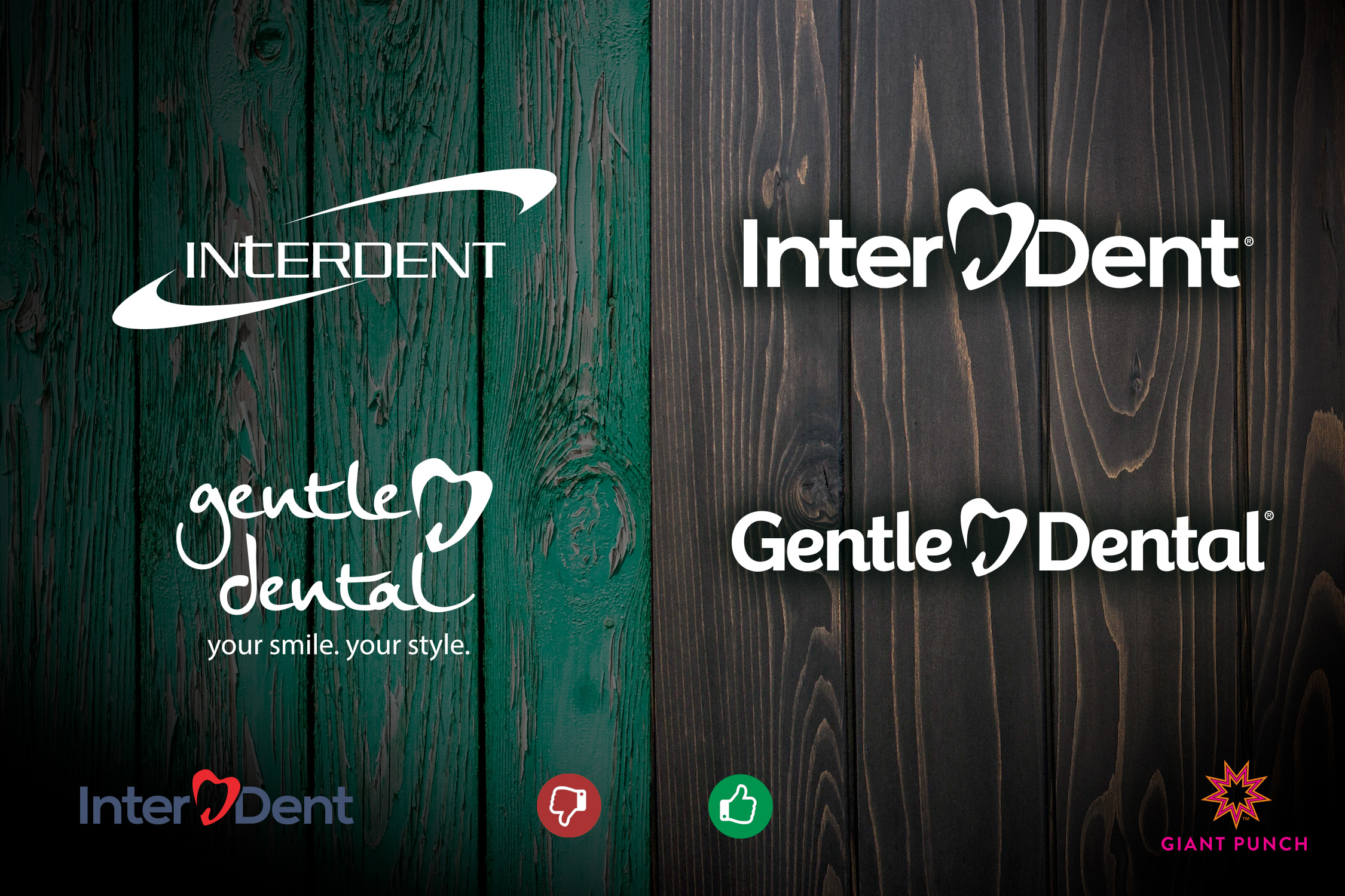
Behold the transformation! The previous logos (seen on the left) were trapped in a bygone era, swamped with complexity and plagued by legibility issues. However, we couldn’t resist keeping the iconic tooth-shaped heart; it’s a cherished symbol that speaks volumes about their brand. We decided to part ways with the tagline and embraced a clean, elegant font for Gentle Dental.
For Interdent, we conducted a makeover that involved bidding farewell to the old logo’s “swoops.” We replaced the font to match Gentle Dental’s, and maintained the same color scheme. To introduce some visual intrigue and balance, we gracefully split the name.
The results are nothing short of bold and contemporary, reflecting both brands in a perfect light. These logos are timeless, and we’re confident they’ll aid Interdent and Gentle Dental in achieving their goals and securing their place as premier dental care providers in the industry.
Interested in the Style Guide we created for Gentle Gentle? Click Here!
Contact us today to get started on your brand transformation!
