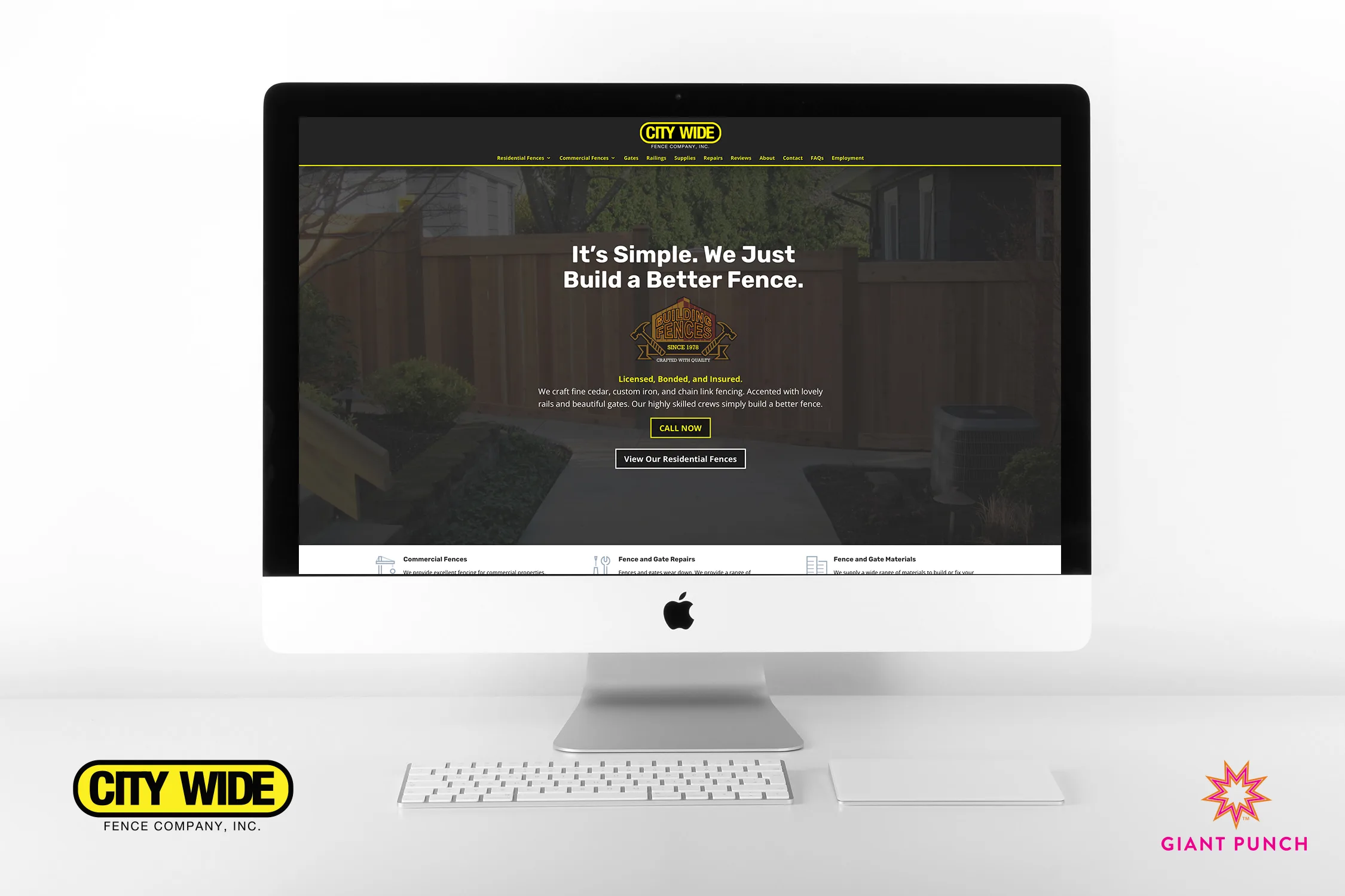
Built to Last!
In the realm of digital transformation, your desktop website is your anchor. At Giant Punch, we relish the opportunity to tackle complex projects, and our collaboration with City Wide Fence Company was no exception. This endeavor centered on creating a robust, versatile, responsive website that could effectively showcase their extensive fencing solutions.
Beyond Boundaries
For City Wide Fence Company, we embarked on a journey to design and develop a website that could truly encapsulate the scale and diversity of their fencing expertise. This was no small feat. Our task included crafting dedicated pages for residential and commercial fencing, highlighting the artistry of custom iron handrails, and more. We aimed to build a digital platform that embodied City Wide Fence’s brand essence while ensuring seamless user experiences.
Visual Storytelling
Our commitment to creative design and innovation led us to create unique custom fence illustrations. These illustrations became the visual centerpiece of City Wide Fence’s desktop website, showcasing the artistic flair behind their work. These visuals help visitors envision the ideal fence for their property and represent our dedication to fostering creativity and providing innovative solutions.
Continuous Support
The digital landscape is ever-evolving, and our commitment extends beyond the launch of your desktop website. We provide ongoing maintenance services, ensuring your site remains responsive, secure, and up-to-date. Our expertise also encompasses Search Engine Optimization (SEO) and Pay-Per-Click (PPC) services, which drive online traffic and conversions, enhancing your digital footprint.
Huge Impact
City Wide Fence’s online presence has seen an impressive ascent on Google and Bing search engines. Their website is now a comprehensive digital showroom, attracting clients and elevating brand recognition. City Wide Fence maintains a dominant position in the fencing industry with our maintenance, SEO, and PPC services.
Mobile Focused
At Giant Punch, we champion mobile-first design as a cornerstone of our responsive websites. With most users accessing websites from mobile devices, ensuring your site is visually appealing and user-friendly on smartphones and tablets is paramount. Our mobile-first approach goes beyond a design principle; it’s a commitment to providing an outstanding digital experience that resonates across all screens. Regardless of the device, we transform your website into a responsive, high-performance, and intuitively designed platform. To embark on a digital journey and peek at how this site looks on Mobile! TAP HERE!
Partnering for Success
Are you ready to embark on a digital journey that maximizes your online presence and engagement? Giant Punch is your trusted guide. We’re dedicated to turning digital challenges into opportunities and ensuring your brand shines brightly online. Don’t hesitate to contact us today, and let’s craft your digital identity together.
