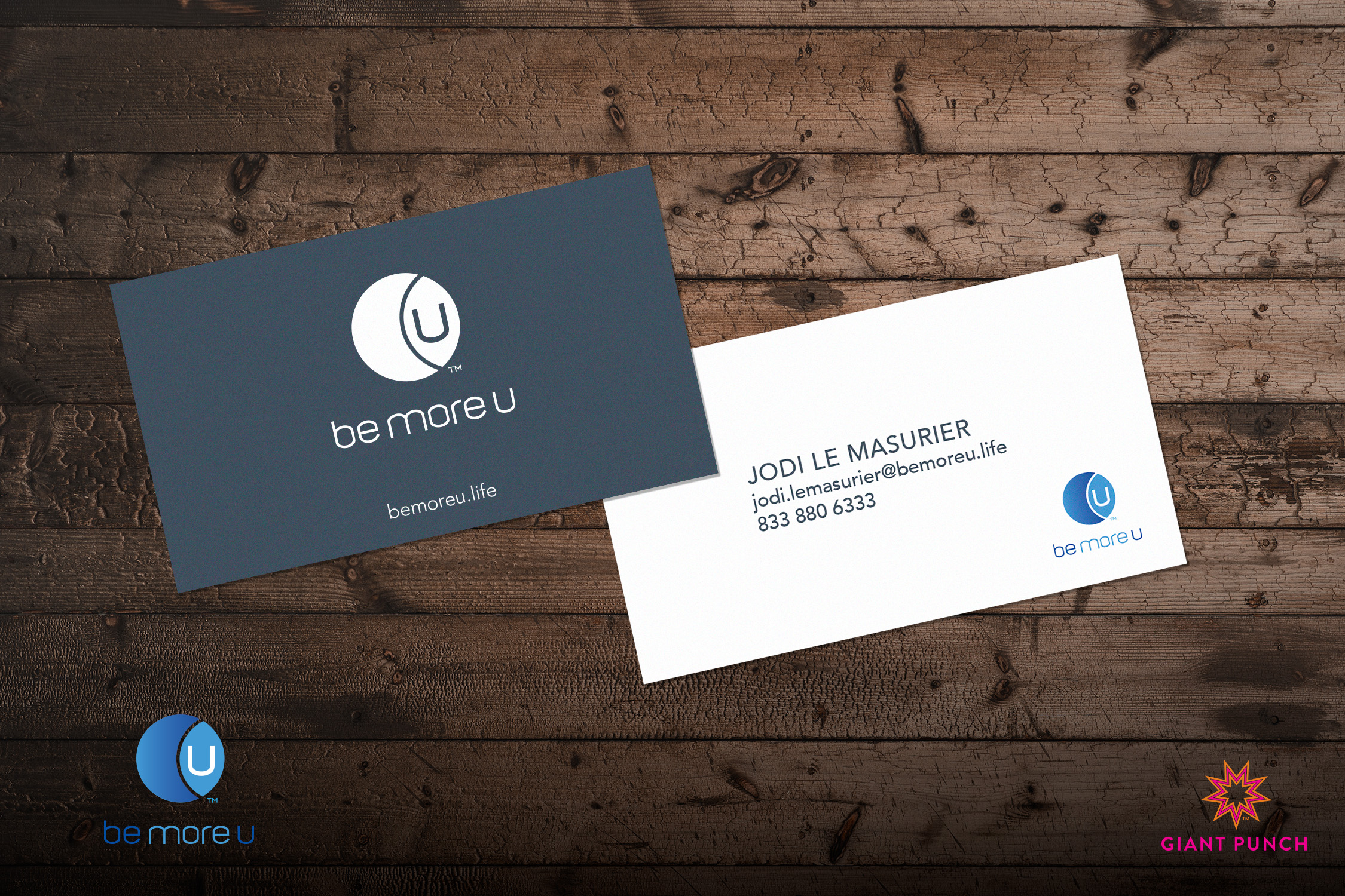
Focused on U.
At Giant Punch, we take great pride in each project, but some touch our hearts on a deeper level. Working with “Be More U,” a beacon of wisdom and self-betterment, was one such experience.
Embracing the Vesica Piscis Symbol
We delved into their core philosophy grounded in the mystical Vesica Piscis symbol for the foundation. This ancient emblem represents life, creation, fertility, regeneration, wisdom, and good luck – the essence of Be More U’s teachings. It became a cornerstone in their branding, a symbol that encapsulates the heart of their mission.
The Power of the Letter U
We also played with the letter “U,” a clever twist. Not only does it hint at “you,” emphasizing the personal transformation they offer, but it expands into “University.” Their journey unfolds as a holistic educational experience.
Letter Press Magic
The business cards, the tangible bridge between their vision and the world, deserved a touch of uniqueness. Each one was crafted with love on a letterpress, ensuring that every card is as distinct as the journey of self-discovery.
Elevate Your Brand
Be More U’s business cards reflect their teachings and the heartfelt connections they form with their audience. If you’re prepared to bring that level of depth and uniqueness to your brand, Giant Punch is here to help.
Let’s create a brand story that’s uniquely yours. Contact us today and embark on a journey to craft an inspiring brand story. You can also check out the lovely website we crafted for Be More U. TAP HERE!
